Redesign of The White Bear Newsletter Signup Form

Redesign of The White Bear Newsletter Signup Form

Optimization of the newsletter signup form on The White Bear coffee roastery website to increase conversion rates.

Optimization of the newsletter signup form on The White Bear coffee roastery website to increase conversion rates.

Sign up for the newsletter

Get 10% off your first order and early access to coffee.

2 messages a month, no spam.

Thank you for signing up!

The discount code for your first order has been sent to your email address :)

Sign up for the newsletter

Get 10% off your first order and early access to coffee.

2 messages a month, no spam.

Sign up for the newsletter

Get 10% off your first order and early access to coffee.

2 messages a month, no spam.

Dołącz do newslettera i zyskaj powitalny rabat - 10%

Solution

I designed a fixed CTA bar placed directly below the main headline, along with a modal featuring a single-step form and clear information about email frequency.

The remaining part of the page was maintained as a static background, allowing full focus on the newsletter signup experience.

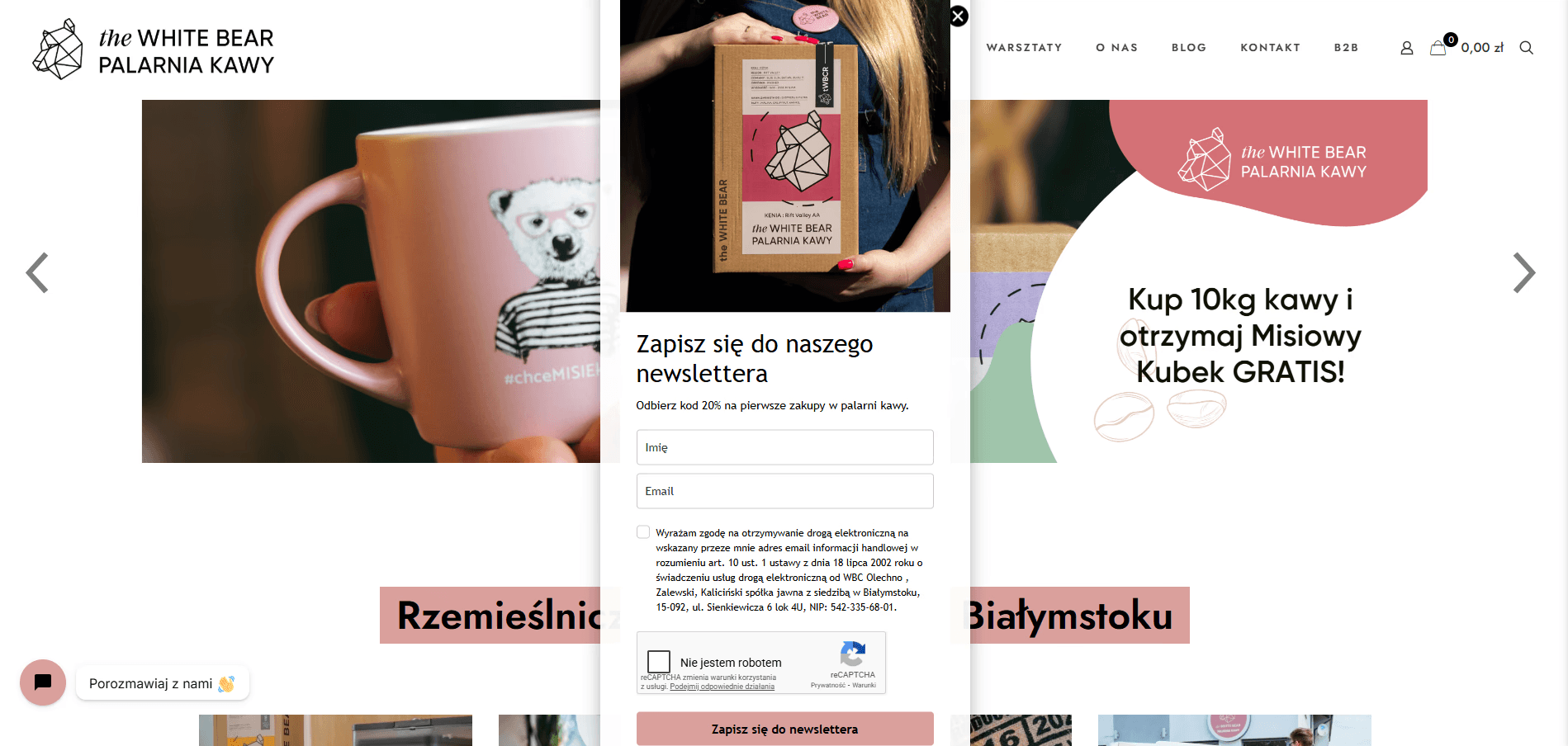
The project scope covered only the newsletter communication within the hero section and the signup modal. The rest of the website was excluded from the redesign.

Problem Understanding

Previously, users were not subscribing to The White Bear newsletter because the message was overwhelmed by excessive content within the hero carousel. The carousel auto-rotated quickly and contained interaction errors, which reduced clarity and distracted users from the newsletter call to action.

Dołącz do newslettera i zyskaj powitalny rabat - 10%

Solution

I designed a fixed CTA bar placed directly below the main headline, along with a modal featuring a single-step form and clear information about email frequency. The remaining part of the page was maintained as a static background, allowing full focus on the newsletter signup experience.

Sign up for the newsletter

Get 10% off your first order and early access to coffee.

2 messages a month, no spam.

Sign up for the newsletter

Get 10% off your first order and early access to coffee.

2 messages a month, no spam.

Testing

During usability testing with five users, all participants were able to easily locate the newsletter signup and successfully complete the process. Four out of five users reported increased trust due to the clear information about email frequency.

THEWHITEBEAR 2025©