

Type: Self-initiated project
Role: UX research, interaction design
Tools: Figma, Framer
Goal: Increase newsletter sign-up conversion by making the sign-up easy to find, clear and trustworthy
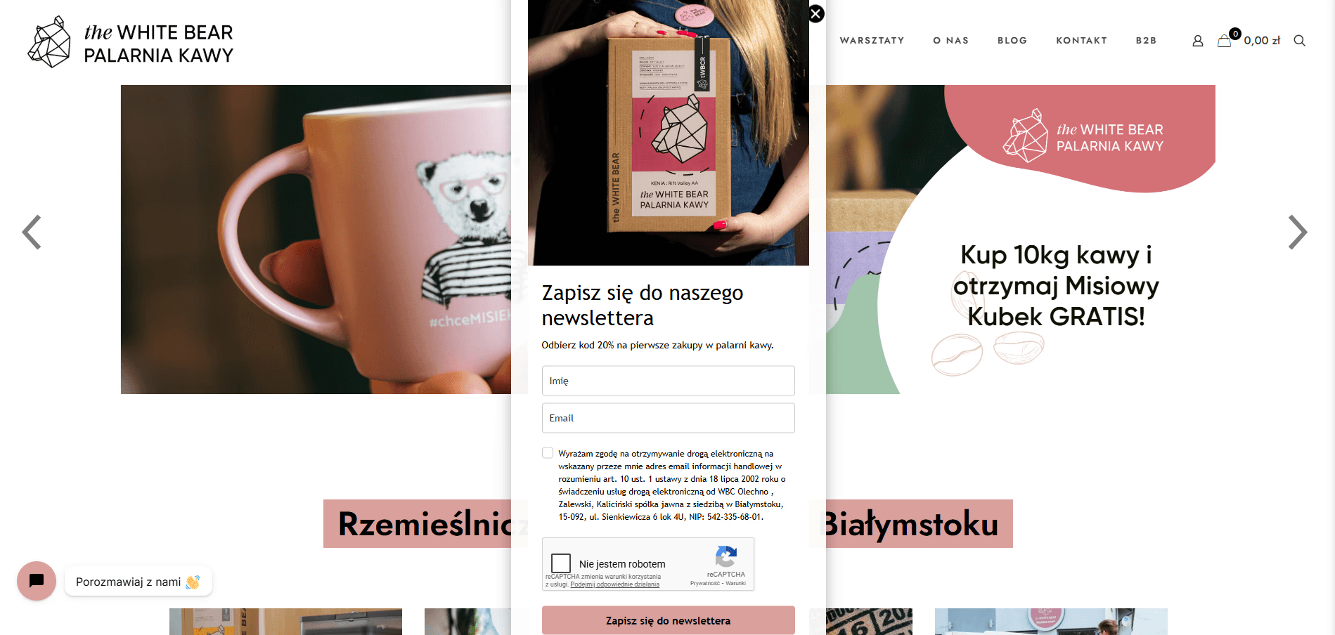
I started with a heuristic audit of the existing website, focusing on the hero carousel and the sign-up window. I deliberately separated what I observed and what I assumed.
The hero carousel autoplays too fast.
The sign-up window is not responsive: on smaller screens elements are cut off.
Visitors may be put off from subscribing when the benefits and the sending frequency are unclear.
A pop-up that appears only once is easy to miss or dismiss,
and the user then cannot find the sign-up again.

I mapped the sign-up flow with decisions and error states:
Visitor notices the sign-up (section or window) →
Enters e-mail →
Gives consent (checkbox) →
Submits →
Success: confirmation message
Error states handled in the design:
invalid e-mail format,
missing consent,

Low-fidelity sketches
Wireframe iterations
& Hi-fi prototypes

Iteration 1: I replaced the time-triggered pop-up with a bar at the top of the page. A pop-up can interrupt users who are already browsing, and once it disappears it’s hard to find again. The bar is always visible and in a predictable place.

Iteration 2: I removed the “Name” field. Signing up should be as fast and simple as possible, and the name is usually linked to the user’s email anyway.

Hi - Fi


Task scenario: “You are visiting a coffee shop’s website. You’d like to receive news and offers by e-mail. Subscribe to the newsletter.”
I compared the old version vs the redesign.
Findings
Task completion: 5 of 5 completed the task without help.
What went wrong: One participant missed the sign-up link and struggled to tap the consent button on mobile. I fixed this by enlarging the bar and adding padding around the button.
4 of 5 participants said they trusted the sign-up more after seeing the frequency and benefit information.
Limitations: a small sample of 5, no A/B test, and participants knew they were being tested. I therefore make no claims about conversion uplift.
What I would measure after launch: sign-up conversion rate (visits → submitted form), form completion and abandonment rate, error rate per error type, and the share of users who find the sign-up without the pop-up.
Show benefits and sending frequency next to the form
Reduces fear of spam and unclear commitment
Make the sign-up accessible beyond a one-time pop-up
A one-time pop-up is easy to miss
Responsive layout, no cut-off elements
The audit showed broken scaling on small screens
Clear error messages for each case
Prevents dead ends (wrong e-mail, no consent, duplicate)


Contrast: text and interactive elements meet WCAG 2.2 AA [ratios: 18:1].
Touch targets: fields and buttons sized for thumbs, minimum 28 px.
Labels: visible labels instead of placeholder-only fields,
so users do not lose context while typing.States: focus, error, success, hover, disabled.
Errors: messages say what went wrong and how to fix it, and are not communicated by colour alone.
Components: the form is built from reusable components with states: default, hover, focus, error, success.

